A procurement team at a Kuwait bank reduced cycle times from 139 days to 57 days (a 59% improvement) through a structured Lean Six Sigma programme. Then they made the most common mistake in process improvement: they kept adjusting the process every time a result looked unusual.
Within three months, variability crept back in. The improvement had not failed. The team was reacting to normal fluctuation as if it were a problem to solve, and that reaction was causing the damage.
This is the hidden cost of operating without statistical process control (SPC), and it is more expensive than most operations leaders realise.
The Two Hidden Costs Nobody Talks About
When teams skip SPC, they expose themselves to two distinct failure modes.
Hidden Cost 1: Discovering drift after a customer complaint.
Without a control chart running continuously, process drift is invisible until it becomes a service failure. You find out the procurement cycle time has crept back to 90 days not from your data, but from an escalation email. By then, the root cause is weeks old and harder to isolate.
Hidden Cost 2: Tampering.
This one is counterintuitive, and it is responsible for an enormous amount of wasted effort in banking operations.
Tampering is what happens when a manager sees a result near the edge of what looks acceptable and intervenes to "fix" it. The result looked like a signal. It was not. It was common cause variation, the natural, expected noise in any stable process. By reacting to it, the manager introduced a new source of variation into a process that did not need to change.
The principle has a name: "Do Not Over-Control." W. Edwards Deming documented it in his funnel experiment. Every unnecessary adjustment to a stable process makes output more variable, not less. You add noise while believing you are removing it, and the process's own data cannot tell you why things keep getting worse.
Common Cause vs. Special Cause: The Distinction That Changes Everything
Statistical process control is built on one fundamental idea: not all variation is the same, and the correct response to each type is opposite to the other.
Common cause variation is inherent to the process as it currently exists. It comes from the sum of many small factors: minor differences in document quality, normal variation in vendor response time, everyday fluctuations in system load. A process showing only common cause variation is stable and predictable. It is performing exactly as designed. The correct response is to do nothing to the individual result. If the output is unacceptable, redesign the process systemically rather than reacting to individual data points.
Special cause variation signals that something has changed. A vendor has changed their internal process. A new staff member is following a different interpretation of the procedure. A system update has introduced a delay. Special cause variation appears as a data point outside the expected statistical limits, or as a non-random pattern within the limits. The correct response is to investigate immediately, find the assignable cause, and correct or incorporate it.
Confusing the two is expensive. Treating a common cause result as if it were a special cause (tampering) increases variability. Treating a special cause as if it were common cause (ignoring an out-of-control signal) allows a real problem to compound undetected.
SPC gives you a method for telling them apart, objectively, based on data, without guesswork.
How a Control Chart Works
A control chart plots process output over time. It has three reference lines:
- Centre line: The process mean (average) calculated from a baseline period.
- Upper Control Limit (UCL): Mean plus 3 standard deviations (mean + 3σ).
- Lower Control Limit (LCL): Mean minus 3 standard deviations (mean − 3σ).
The ±3σ range is not arbitrary. It reflects approximately 99.73% of expected output in a normally distributed, stable process. Any point outside these limits is statistically unlikely to be random; it is a signal that something has changed.
Within the limits, points can still indicate special causes if they form non-random patterns. Common detection rules (Western Electric Rules) flag specific patterns: eight or more consecutive points on the same side of the centre line, or two out of three points in the outer third of the control limits. Either pattern suggests the process is shifting even without a point breaching the limits.
The chart does not tell you what changed. It tells you when to look.
Choosing the Right Chart
Different data types require different control charts. Using the wrong chart produces misleading limits.
| Situation | Chart Type | Example in Banking |
|---|---|---|
| Individual measurements, one data point at a time | I-MR (Individuals and Moving Range) | Daily average loan processing time |
| Subgroups of 2–10 items, measuring a continuous variable | X-bar R | Weekly average of 5 sampled transaction approval times |
| Proportion defective (yes/no outcome, variable sample size) | p-chart | Percentage of KYC forms submitted with errors per week |
| Count of defects per unit (variable opportunity) | c-chart | Number of errors per 100 loan files reviewed |
For most banking operations teams starting with SPC, the I-MR chart is the right entry point. It requires only one data point per time period, it is straightforward to construct, and it handles the individual cycle-time measurements that operations teams already track.
The Tampering Problem in Practice
Here is what tampering looks like in an operations meeting.
The team reviews this week's document turnaround time: 4.2 days against a target of 3.5 days. "That's too high—what happened?" The operations lead traces it to a specific case with a compliance query. A new rule is introduced: compliance queries escalate immediately to a senior officer.
Next week, turnaround: 3.1 days. "The fix worked." The week after: 4.8 days. "The fix isn't holding—what's wrong now?" Another intervention. Another adjustment.
None of those results were special cause signals. All were within the natural variation of a stable process. The target was unrealistic given the current process design, but the process itself was not malfunctioning. Each intervention introduced new rules, new handoffs, new confusion, and increased variability over time.
A control chart on that same data would have shown all those points inside the limits. The message from the data: the process is stable. If the stable average is too high, redesign the process. Do not chase individual results.
This distinction matters enormously in banking, where operations teams are under constant pressure to explain every variance. SPC gives leaders a defensible, data-backed way to answer that pressure: "This result is within normal process variation. There is nothing to fix here. If you want the average lower, we need a process redesign conversation."
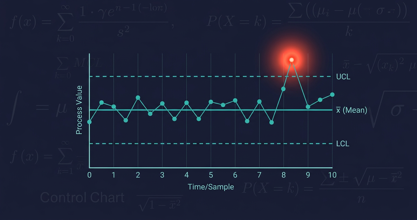
The Kuwait Bank Control Phase: SPC in Action
The Kuwait bank procurement improvement illustrates how this works in practice. After reducing cycle times from 139 days to 57 days through DMAIC, the team entered the Control phase. You can read the full case detail in our DMAIC example for banking procurement.
The Control phase team set up an I-MR chart on procurement cycle time, using the post-improvement baseline to calculate control limits. The centre line sat at 57 days. UCL was set at 81 days. LCL was set at 33 days.
On day 47 of monitoring, one data point plotted above the UCL: a single procurement case had taken 89 days.
The team investigated. They found vendor SLA drift: a specific supplier had quietly changed their internal approval process, adding a new sign-off step that added 12 to 18 days for certain contract types. This was a genuine special cause signal. The team contacted the vendor, updated the SLA terms, and corrected the outlier.
Without the I-MR chart, that vendor drift would have been invisible. The procurement team would have continued processing orders, variability would have accumulated, and the drift would likely have surfaced at the quarterly review six weeks later. By then, multiple contracts had been delayed and the root cause was buried under subsequent process noise.
The control chart compressed a six-week discovery lag into a same-week response. That is the operational value of SPC in the Control phase of any DMAIC-based improvement.
Software Options for Building Control Charts
SPC does not require specialist software. The right choice depends on scale, technical capability, and budget.
Minitab (~$1,500/year) is the industry standard for Six Sigma practitioners. It automates chart selection, applies Western Electric Rules automatically, and generates publication-quality outputs. For teams running multiple improvement projects simultaneously, the automation justifies the cost.
JMP (SAS product, similar price range) offers strong statistical depth and interactive visualisation. It is favoured in manufacturing and pharmaceutical environments where process capability analysis is intensive.
Excel is viable for I-MR charts. If your data volume is modest (one measurement per day or per week), a well-built Excel template with UCL/LCL formulas handles the job adequately. The limitation is manual effort and the absence of automated rule detection.
Python (free, open-source) is scriptable and powerful. Libraries like scipy, pandas, and matplotlib support all standard control charts. For operations teams with data engineering capability, Python offers the most flexibility, especially for connecting to existing data pipelines and automating chart generation. The investment is in setup time, not licence cost.
The tool matters less than the discipline of reviewing the chart regularly and acting on signals appropriately. A control chart reviewed monthly is significantly less useful than one reviewed weekly.
Connecting SPC to Your Broader Improvement System
Control charts are not standalone tools. They sit at the end of a DMAIC cycle; the Control phase exists specifically to verify that your improvement is holding.
The process improvement KPIs you track in the Control phase become the inputs to your control charts. If you have defined KPIs like cycle time, error rate, and throughput, you have the data for your charts. The question is whether you are looking at that data in a way that distinguishes signal from noise.
Most operations dashboards in banking show trend lines, targets, and RAG status. They do not show control limits. That means they cannot distinguish between a process that is deteriorating and a process that is fluctuating normally. Both look the same on a dashboard: a number above target.
SPC adds the statistical layer that makes the distinction objective. You stop managing to targets and start managing to process stability, which is the only foundation from which sustainable performance improvement is possible.
Your improvement held at 30 days. Is it still holding now?
That question separates teams that sustain improvement from teams that repeat improvement projects. Bad processes cost organisations 30% of annual revenue. Recovering that loss requires improvement projects to actually hold.
The 30-day post-implementation review is a standard checkpoint. The 90-day review is less common. Six-month verification is rare. The uncomfortable reality is that process drift often begins between the 60- and 90-day mark, when close monitoring has relaxed and the team has moved on to the next project.
A running I-MR chart catches drift in real time. It does not require a scheduled review. It surfaces the signal when the signal occurs.
If your team has completed a Lean Six Sigma improvement in the last 12 months and is not running control charts on the key output metrics, you are operating on assumption. You believe the improvement is holding. The data may tell a different story.
ESSAM's approach to the Control phase includes SPC setup as a standard deliverable, not an optional add-on. The reason is exactly this: the value of any process improvement is only realised if the improved process remains controlled. A 59% cycle time reduction that drifts back to 80% of baseline within six months is not a 59% improvement. It is a temporary result.
Building the SPC infrastructure during the improvement project, not after it, ensures the measurement system is in place before the team's attention moves elsewhere.
Frequently Asked Questions
What is statistical process control in simple terms?
Statistical process control monitors a process over time using data and charts. It distinguishes between normal variation (which you should ignore) and genuine signals that something has changed (which you should investigate). It prevents teams from reacting to random fluctuation while ensuring real problems are caught quickly.
What is the difference between a control chart and a run chart?
A run chart plots data over time with only a median reference line. It shows trends and patterns but has no statistically derived limits. A control chart adds upper and lower control limits calculated from the process's own variation, which makes it possible to apply objective rules for detecting special cause signals. Control charts are more diagnostic; run charts are simpler but less precise.
How do you know when to react to a point on a control chart?
React when a point falls outside the UCL or LCL. Also react when a non-random pattern appears within the limits: eight consecutive points on one side of the centre line, or two out of three points in the outer third of the limits. Any point inside the limits and not part of a pattern should be left alone as common cause variation.
Can we use SPC if we only have a small number of data points?
Control limits calculated from fewer than 20 to 25 data points are less reliable because they do not yet represent a stable baseline. For new processes or post-improvement monitoring, collect at least 20 measurements before finalising your control limits. In the interim, use the chart directionally (it will still flag extreme outliers) but avoid over-interpreting borderline points.
Does Essam.ai help set up statistical process control for banking operations?
Yes. Essam.ai includes SPC setup as part of the Control phase in its agentic AI-led Lean Six Sigma transformation programmes. This covers chart selection, baseline calculation, control limit setting, and integration with existing operations dashboards. The goal is to make SPC a routine part of operations monitoring rather than a one-time project deliverable.
Every process drifts. The question is how fast you find out.
Equipment changes. Staff turn over. Supplier behaviour shifts. Regulatory requirements evolve. Your process will move from where you left it. Statistical process control does not prevent that. It surfaces drift as a signal, early, before it compounds into a service failure or a process regression that requires a full re-run of the improvement project.
The two failure modes described above are both avoidable: discovering drift after a customer complaint, and worsening a stable process through well-intentioned over-control. Both require the same infrastructure: a running control chart, a team that has internalised the difference between common and special cause variation, and a consistent discipline of responding appropriately to each.
If your improvement programme does not include SPC in the Control phase, you are completing four-fifths of the work and discarding the part that determines whether the other four-fifths hold.